Introduction
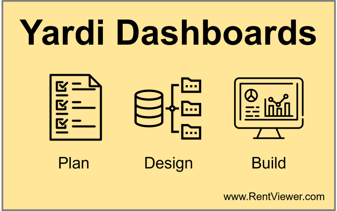
There are canned Yardi dashboard products out there. If you have already looked at them and concluded you need more flexibility and customization, this article will describe how to plan, design and build your own Yardi dashboard. We speak with many real estate companies that have attempted to build dashboards to visualize and analyze the data that’s in Yardi. Most abandoned their efforts before the dashboards were completed. There are many reasons why Yardi dashboards projects don’t succeed. In this article we will discuss why such dashboard projects don’t succeed and will describe a step by step process for ensuring success in planning, designing, building and deploying Yardi dashboards that get used by multiple departments in your company.
Who This Article is Written For
For this article, we are assuming you work in a real estate investment and management company that uses Yardi. You have seen demos of the Yardi Elevate suite of products and concluded they don’t allow sufficient customization. You see how your company can benefit from better metrics and dashboards, and you have already invested some time exploring tools like Power BI and Tableau. And now, you envision building your first dashboard that you want a department such as Asset Management, or Acquisitions, or Operations to use.
Building a dashboard isn’t only about showing your data in bar charts and pie charts. To build a Yardi dashboard that actually gets used by others in your company involves a lot more than learning how to use a dashboard tool like Microsoft Power BI or Tableau.
Building Dashboards is Not Always Straight-Forward
Having built over 500 dashboards, for more than 50 real estate companies, we have compiled a playbook for building dashboards that actually get used and provide real value. We will start by describing what a successful Yardi dashboard project looks like, and the five key steps for building your first company-wide Yardi dashboard.
A well-built dashboard shines the light on strengths and weaknesses in other departments. That kind of change inherently draws resistance within a corporate setting. So, the first place to start is by defining success and to recognize that there will be several headwinds as you work towards your goals.
What Does a Successful Dashboard Project Look Like?
Let’s start with the goal in mind. A successful dashboard project has these attributes:
- It gets used by the people it was intended for
- It delivers measurable value, in terms of early detection of problems, cost avoidance and overall productivity improvement.
- It starts a cycle of continuous improvement for addressing data quality, internal training, and rolling out of better metrics for performance tracking and accountability.
Headwinds Slowing Down Your Project
One would wish that a noble goal, such as providing visibility of performance metrics through a dashboard, is welcomed in a corporate environment. In reality, that’s not always the case. These are some the headwinds your project will encounter before getting to the finish line:
- Lack of executive buy-in
- Data quality
- Technology complexity
- Inertia and reversion to status quo (“Excel works just fine!”)
- Lack of implementation skills
Use This Process to Plan, Design and Build Your Yardi Dashboard
The method you follow for planning, designing and building your Yardi dashboard should take into account the headwinds. At RentViewer we have a proven dashboard development process that has been used for building hundreds of dashboards. Since this is your first Yardi dashboard project, below is a simplified version of our process for companies that use Yardi. Reread the definition above of “a successful dashboard project” above, and follow these steps:
- Get executive buy-in
- Set dashboard goals and scope
- Design the Dashboard
- Develop the Dashboard
- Support the users
- Make continuous improvements
Executive buy-in
If you are building your first dashboard without the sponsorship of an executive of your company, you will have limited success. Many C-level people at real estate investment and management companies we have spoken with see dashboards as “pretty charts” and consider analytics to be an expense instead of an investment.
Additionally, many analysts who are good at Excel want to keep doing things in Excel. You will need them on board as well, at some point. Spend time demonstrating the value of data analytics. Get the support of senior executives in your company, and your chances of success are going to be high.
Your project is going to run in to challenges and you probably don’t have enough clout to deal with them. For example, before the dashboard is useful, some data cleanup needs to be done in Yardi by operations. Or, you need the help of someone with the right privileges in Yardi in order to get a specific lookup value added. It will be easier to ask an executive to get these done.
This may be a cart before the horse situation. If there’s no useful dashboard yet, how can executives get behind the idea of investing in dashboards? The answer is to quickly build a simple dashboard that provides useful information. Keywords are quick (days not weeks), simple (one KPI) and useful (shines a light on a known problem). That takes us to the next step, “Dashboard Goals and Scope”.
Yardi Dashboard Goals and Scope
Before you start building your dashboard, spend time planning. Since this will be your first dashboard project to go live, keep the scope very limited. The dashboard should help focus on a problem that is already known, such as:
- Slow collections
- Large budget variances
- Surprise expenses
Now scope it such that the dashboard can be built from a single data extract from Yardi. For the above problems, these reports might be useful:
- Slow collections: Accounts Receivable Aging
- Large Budget Variances: Actual vs Budget
- Surprise Expenses: General Ledger (filtered for Account Type = Expense)
The reason for recommending a simple data source for your first dashboard is to avoid technical challenges with data modeling once you have started building in the front end tool, such as Power BI or Tableau.
One way to assess the potential complexity is to imagine you are preparing the data in Excel. If you can get an export from Yardi that already has the columns you require, then there’s no need to have multiple exports linked together with VLOOKUPS and SUMIFs. Such a bulky Excel file can contain inherent errors, especially when you refresh the datasets separately and they are different levels of detail (such as by unit by day vs by property by month).
Yardi Dashboard Design
When we build dashboards, we split the design into three distinct design steps:
- Visual Design
- Technical Design
- Data Source Design
Visual Design
Visual design is sketching the visual elements of the dashboard, the features that the dashboard users will see. Not all types of data visualizations are appropriate for a dashboard. This article describes some commonly used visual chart types. Decide what will work best for your audience. We recommend having a design style guide that sets standards for color palettes, font sizes, and placement of visual elements with the goal of enhancing the user experience.
Technical Design
The technical design addresses these questions:
- What technology will be used to build the dashboard, such as Power BI, Tableau, Looker etc.
- How the dashboard will be built
- Where the dashboard will be published and hosted
- How it will be accessed by users and secured
- How the data will be refreshed
Front-End Technology: There are over 20 viable dashboard development tools out there. They have names like Power BI, Tableau, Klipfolio, Domo, Quicksight, Looker and so on. They all have their pros and cons. Some are good for displaying KPI, while others enable you to do data exploration and analysis. Find out if your company is already using one, or if your IT department has a preference. All such tools will require IT support eventually, so you might as well engage your IT department early.
Dashboard Development: Some dashboard development tools are fully web based, while others also have a desktop application. Some require a developer license, while others don’t have a specific license for dashboard developers. Power BI’s dashboard development tool is called Power BI Desktop. It installs on a Windows PC and is free of charge. Tableau’s dashboard development product, called Tableau Creator Desktop, requires an annual subscription of $840. However, this is not an apples to apples comparison. Tableau Creator Desktop enables very powerful ad-hoc data analysis that is not possible with Power BI Desktop. While you are contemplating the technical design of your dashboard, you should already have a clear idea of which tool you want to use.
Dashboard Hosting: Most dashboards can be published to the cloud. So, when the dashboard users want to look at the KPI, they will use their browser to go to an external we page (such as a Power BI workspace, or Tableau Online), login in, and view the dashboards they have access to. Some tools allow hosting the dashboards on-site, but that’s more complex and if you are just starting out, focus on the cloud option. Hosting dashboards in-house (or “on prem”) requires a significant amount of technical work. Companies that are likely customers of RentViewer usually don’t have the bandwidth to take on such responsibilities.
Dashboard Access and Security: Most dashboard products require that users have a license. For example, a Power BI license costs approximately $120 per user per year, and a Tableau license is $180/year. What you get for this is the ability to limit the visibility of your dashboards to only those who are authorized to see them. You can also apply more granular security policies, for example, ensuring that community managers and regional managers can only see the metrics for their properties. If you are a third party manager, you can use one dashboard and enable all licensed owners to view it, while being sure that each owner can see only their properties.
Data Source Design
The data source design is usually the most crucial piece of the solution for any dashboard. It defines how the data that’s in Yardi will be consumed by the dashboard. Before the data reaches the dashboard, it has to be extracted from Yardi, processed, and joined with other data sets in order be usable by the dashboard. Many dashboard projects get abandoned because the complexities inherent in the data source design. That’s why we emphasize keeping the data source simple. One way by which RentViewer keeps data source design simple is implementing the relationships between data tables in the SQL database. We create “views” that contain the columns required for a specific dashboard data source. This simplifies the dashboard development process and changes are easier to implement with this approach.
Dashboard Development
Dashboard development involves building the front end, building the data model, and ensuring that the data can be refreshed when needed. For your first dashboard project, most of this work will likely be done in the front-end tool such as Power BI or Tableau. For more complex projects, the data modeling is done in the SQL database by a data engineer.
If you follow our recommendation to keep your dashboard simple, this should not be a technically challenging phase. Be prepared to iterate, producing multiple versions of the dashboard.
Calculated Fields: The person developing the dashboard will work on two main distinct activities: Data modeling and front-end development. Data modeling involves ensuring all the columns required are available, at the right level of granularity. The heavy lifting for this should have been done in the Dashboard Design step. The developer will also need to define new calculations. Power BI, given its Excel roots, has very powerful features for defining formulas and creating calculated fields. Tableau also has very powerful built-in formulas, for example the “Level of Detail Expressions.”
Iterations:
The process to plan, design and build your Yardi dashboard is an iterative process. Success is in the eye of the audience you are building the dashboard for. So, instead of rolling out the dashboard once it is perfect, get feedback and buy-in for each draft. Refine the dashboard based on their suggestions and improve its usability and relevance. Be prepared to learn that information that is so obvious to you is not so to the users of the dashboard. It’s okay to get back to the drawing board after releasing the first version of the dashboard. Sometimes it is not possible for the user to know what is useful until they try out the dashboard and give you feedback.
The feedback can include a range of change requests, from substantive to insignificant. Have a process for prioritizing the changes.
One way to manage the iterative process is to control the scope and type of changes permitted in each iteration. Time-boxing each iteration (to say one or two weeks each) will ensure that the most essential changes are worked on.
User support and continuous improvement
Once the dashboard has been built and gone live, the developers need to stay in contact with the users and actively elicit feedback. Find out if the dashboard is useful, and what changes would make it even more useful. If the dashboard is rarely being looked at, the developers need to find out why. The reasons for disuse could include lack of confidence in data accuracy, timeliness of information, difficulty in getting the answers needed from the dashboard, or simply that people can do their jobs just as well without using the dashboard.
Unless each department is executing flawlessly, there probably is a need to keep an eye on metrics and take timely corrective action.
The tools you can use to ensure the dashboard users get value from the dashboard include:
- Designate a point of contact for questions and suggestions,
- Regular check in with dashboard users to get their feedback
Depending on the org structure of your company, it may be necessary to assign another team to support the users of the dashboard.
Dashboards don’t “last forever”. If your dashboard does get deployed and gets used, it will eventually either get retired or it will evolve into newer versions. This is natural, because once a set of metrics become commonplace, and the underlying business processes are optimized, the focus moves to different processes and different metrics for tracking performance.
Conclusion
There you have it. It is frustrating to spend months building something that your co-workers and executive team are ambivalent about. There is so much valuable data in Yardi. Imagine the benefits to your company if that Yardi data could be translated into insights through well-designed dashboards.
If effort is directed at the beginning to winning buy-in for your project, the actual dashboard development goes much more smoothly. It’s a great feeling when your brainchild dashboard comes to life, and you see it getting used by your peers because it actually helps them do their jobs better.