
Your Property Management System contains valuable data that can tell you how your business is performing and where opportunities lie for doing even better. Running standard reports is a common way to look at the data and make meaning out of it. Some companies export the reports into Excel to further analyze the data. Another way of better understanding the data is data visualization. Keep reading for a deeper dive into real estate data visualization.
In this blog post I will discuss eight visualizations of data from systems such as Yardi, Appfolio, Entrata and Rent Manager that are designed to answer specific business questions.
1. What are the biggest expense line items?
For real estate data visualization the chart below visually displays the General Ledger report. For each expense GL account, we are displaying the total activity in a horizontal bar. This makes it easy to identify the biggest expense items in each year, as well as to see which ones have increased or decreased.

2. Are rents above or below market?
No one wants to leave money on the table by renting below market. Here’s a simple chart that shows the properties that are renting above or below market rent. For each property, the blue dot shows the effective rent per square foot, and the red dot shows the market rent per square foot. The distance between the dots shows the magnitude of difference. When the blue dot is to the left of the red dot, the effective rent is below market.

3. Is the rent for Deluxe amenity apartments more than the rent for Standard?
Not all units are the same. Some have more amenities, and therefore should rent for more than others. By examining the rent roll we can make sure that rents are set optimally. In this box plot we are looking at the spread of Rent Per Sq Foot for the 2BR/2BA units across several buildings in a portfolio.
Each dot represents an apartment. This operator categorizes their apartment amenities as Standard, Premium and Deluxe. The color of the dot shows the amenities of the apartment. As we can see from this rent roll, some of the Deluxe apartments have a lower rent per square foot than the Standard apartments in each building.

4. What is the variance in budget vs actual?
When it comes to performance against budget, we want to know the biggest items in our P&L and their variance to budget. The chart below is called a bullet chart.
The bullet chart has two components. The length of the blue bar tells us the actual amount. And the orange “notch” tells us the budget. This way we can visually identify the items that are below or above budget, and by how much.

5. How long do service tickets remain open?
We know that some service tickets stay open longer than others. When the goal is to improve response times for closing tickets, it’s helpful to visualize the “spread” of ticket open times, from the lowest to the highest. Below is a “box plot” and each dot represents a ticket. The vertical position of the ticket dot shows how many hours it has been open.
Here, we are showing the tickets of each technician and the median open time. When filters are added, for example, by ticket type, we can isolate the ones that need attention.

6. What are we paying our vendors?
It’s useful to know how much business we are doing with our vendors, and if the amount has been increasing. Here we use a simple line chart to show our payments to two plumbing companies. Such charts can be very interactive with the use of filters. Any number of vendors can be selected for display by simply clicking on filter options.

7. What is the progress towards lease up goals?
Lease Up is an important metric in Student Housing. Here’s a very simple and effective way to see progress towards Lease Up goals. This is a “combo” chart showing bars and a line. The line is the target. The bar shows the actual Lease Up % for each month.

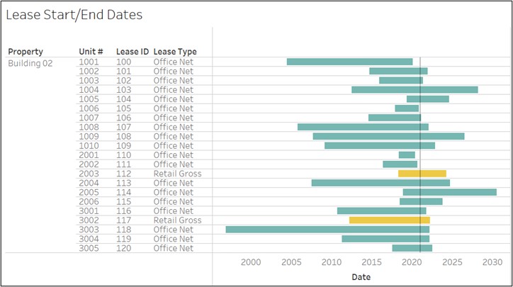
8. Which leases are ending soon?
To visually display leases that are about to end, we are using a Gantt chart. Each horizontal bar is a lease. The bars start at the lease start date and extend through the lease end date. The vertical black reference line can be adjusted at the preferred point in time to show leases ending in its vicinity.
RentViewer helps real estate executives monitor metrics and drive business performance using real estate data visualization and data analytics. RentViewer builds cloud data warehouses and business intelligence solutions using Power BI and Tableau. Our solutions are designed for asset managers and decision makers who want to spend more time seeing and understanding their data and less time managing Excel files.
Start making smarter decisions today! Click book an appointment or call (248) 601-6400 to speak with a real estate analytics expert.